A new news & lifestyle experience
How a small cross-functional team created an engaging and profitable house porn experience

Overview & role
In early 2016 I joined a team of 4 engineers and a product manager as the lead UX & Visual designer looking to improve our News, Insights & Lifestyle content experience.
Our primary goal was to improve engagement with our content, offer new mutimedia opportunities and optimise the experience for mobile. Our ultimate goal was the rabbit hole effect: an immersive frictionless browse experience for home lovers.
Problem & opportunity
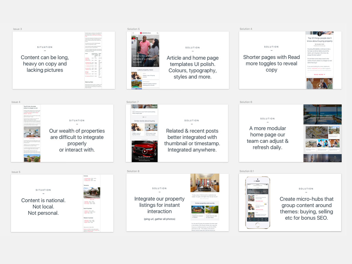
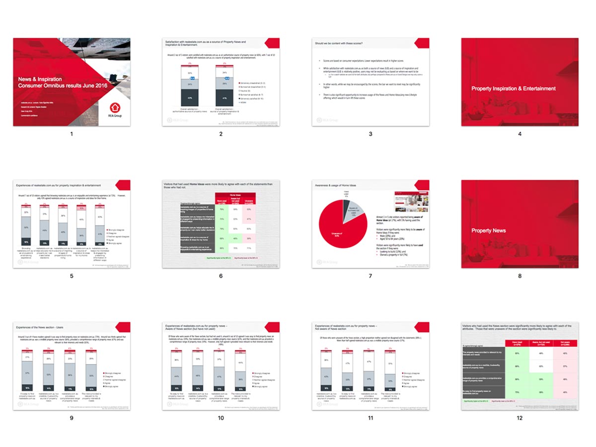
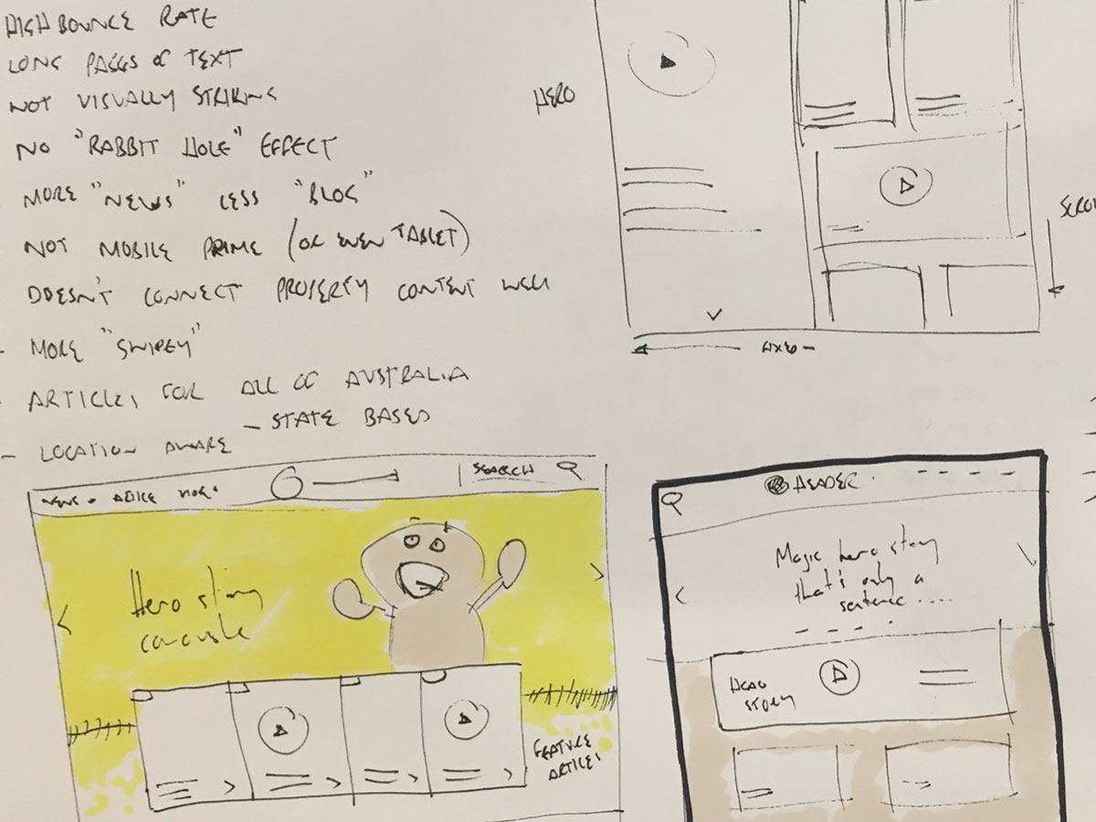
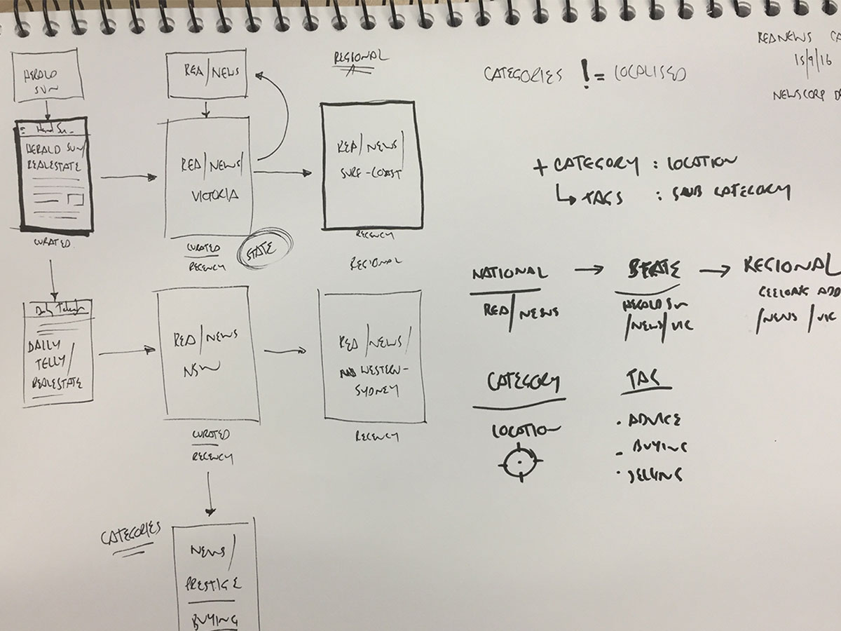
Reviewing metrics for our News section we identified some issues with the mobile experience, namely with articles per user, time on site and scroll depth. This indicated challenges around both the content and the mobile experience.
And of course we talked to a lot of users
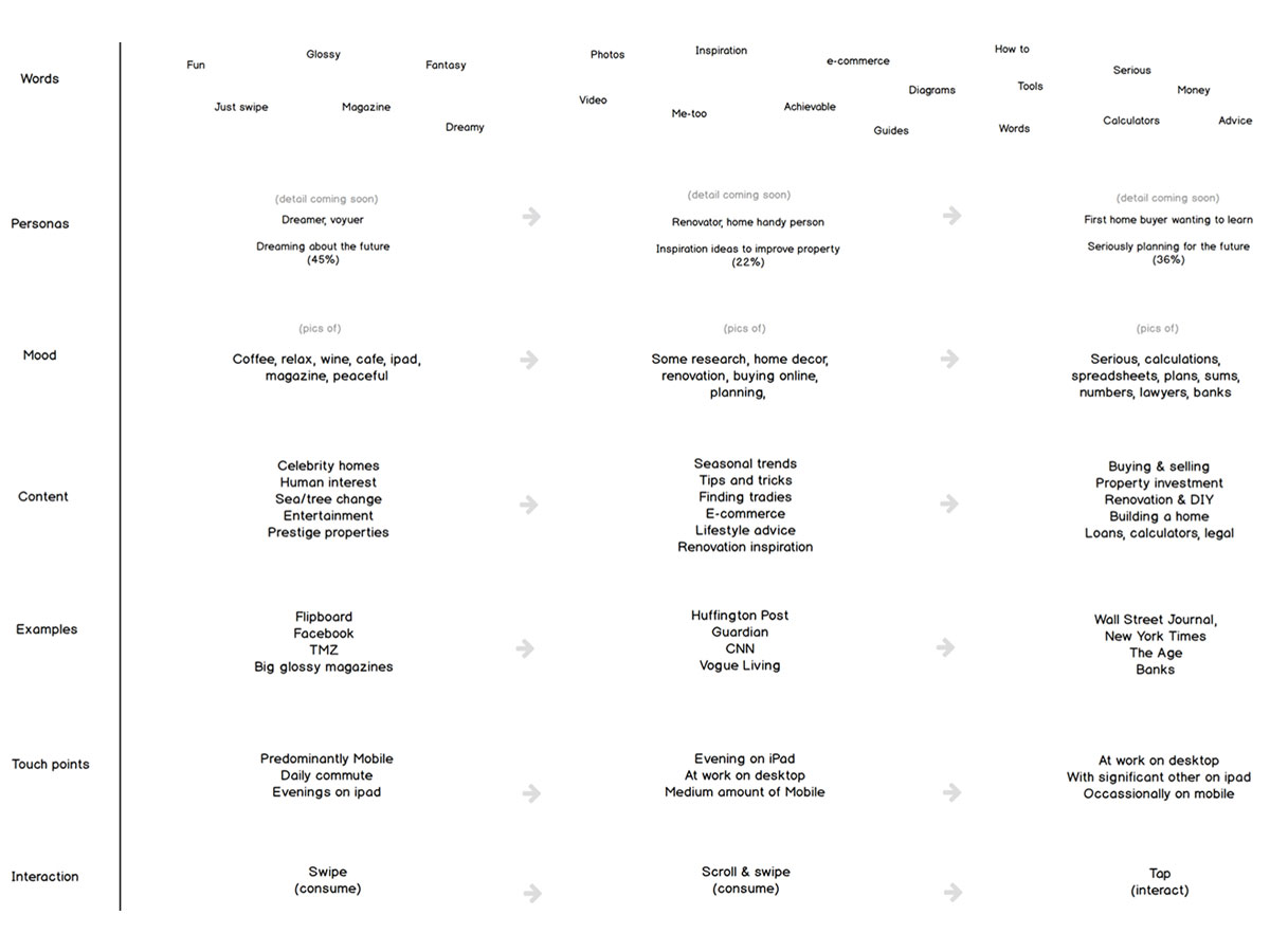
We also interviewed early stage home buyers (known as "dreamers") and folks who identified as being interested in lifestyle and browsing content. Common feedback was that it was more difficult to find the content they liked and it was rarely relevant when they visited.
I'm in Melbourne, I don't want to see articles about Sydney mansions when I can't afford it & don't live there - Property news reader
Ideation & concepts
I also created a project wall which included our key metrics, current engagement numbers, a large mood board capturing the key themes. We also included examples of other news & content sites along with some samples of nice visual treatments we wanted to consider.

Just check a few links on my phone for something to do. I just love photos. - Property news reader
I lead a whole day workshop with the entire team to explore ideas and agree on something to validate with users in person within a week. The team produced a number of sketches we grouped then using red dots identified core functions and experiences. I quickly turned these in to wireframes and basic prototypes in Invision.
Everything mobile prime, mobile first.
Prototype & testing
We tested a number of key concepts with users including:
- Consistent hierarchy with prominence for media (photos, video)
- A new swipable photo gallery near the top
- Truncating the content with a Read more toggle
- Relevant similar content panels immediately below the toggle
- A new video component with thumbnail playlist
- Some shiny new media placements to test user tolerance

All five of the concepts were either accepted by users or they had no objections to them. Our research team also ran a study on the most popular content which we promoted in the experience.
Confident we were on the right path the team started building the backend and interface whilst I iterated on the experience.
Visual design
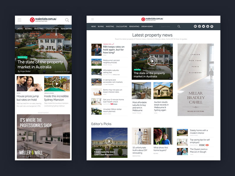
We wanted to make the photos bigger and make the content easy to read so typography, font sizes and white space were paramount. REA has an extensive UI library but we took the opportunity to give the experience more of a traditional news feel whilst remaining contemporary for a digital medium.

We looked at several serif typefaces for key headings and content, in addition to being the voice of our brand. A monospace font was also added for data and labels whilst we retained our brand sans-serif font for body copy.
Impact & results
After three months of working in our cross-functional team we went live with the new news experience and the results were immediate:
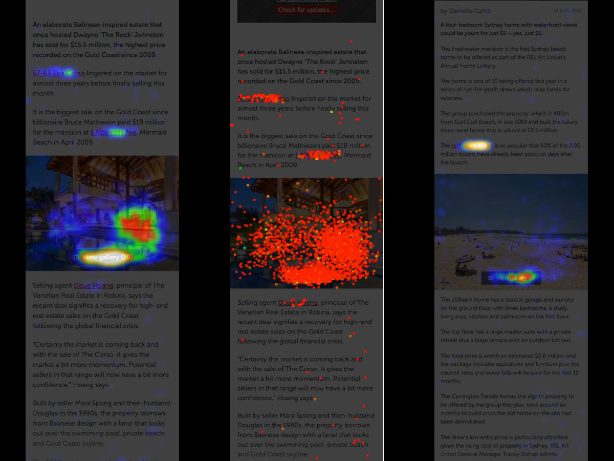
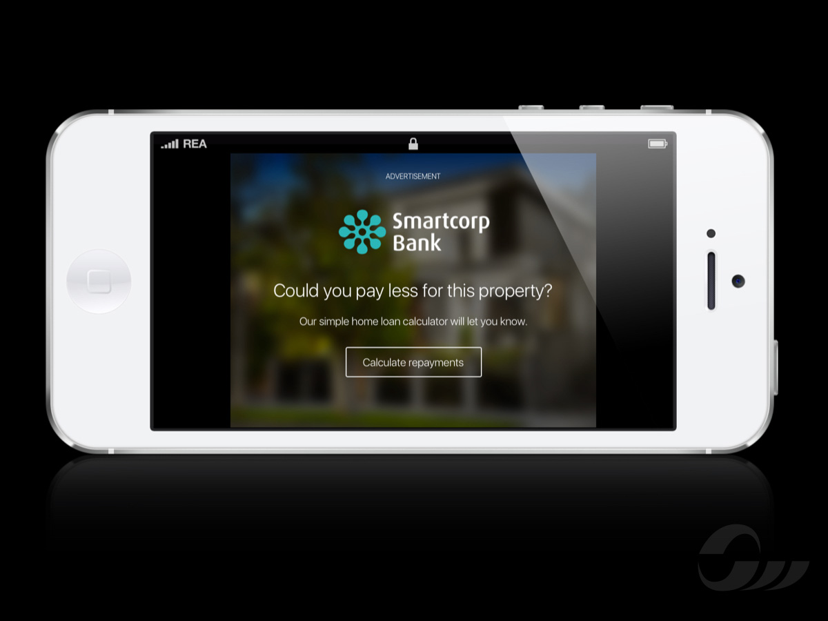
Including some heatmaps of user engagement with our new experience, as well as examples of our media placements which would go on to be highly profitable for the company, rolled out across our photo galleries on mobile to be a multi-million-dollar product.