- Break work in to small, achieveable chunks
- Get the team to estimate their work and schedule check-ins
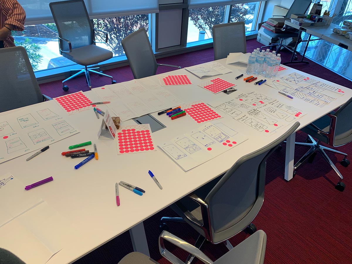
- Low fidelity fast. High fidelity slow. Generate lots of ideas quickly then take your time to finesse them.
- Mobile Prime. Mobile First.

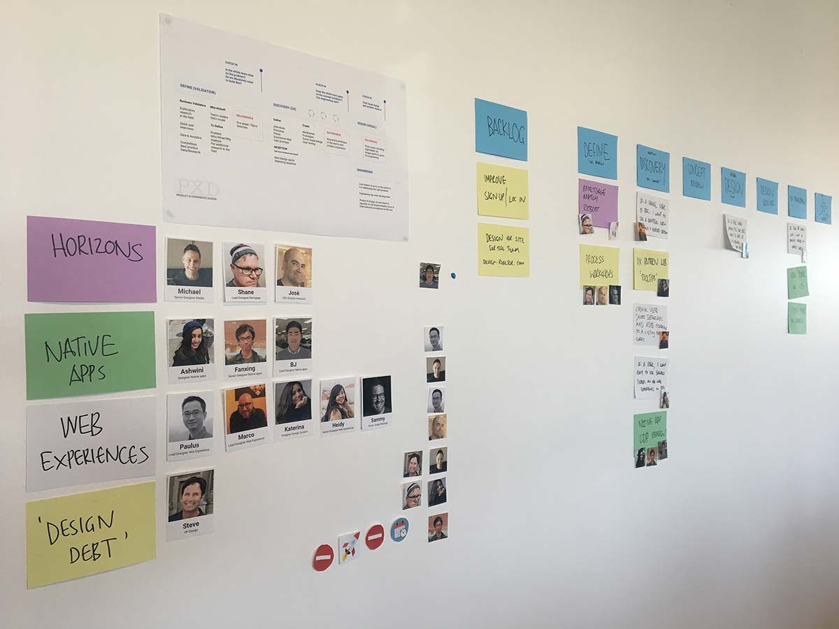
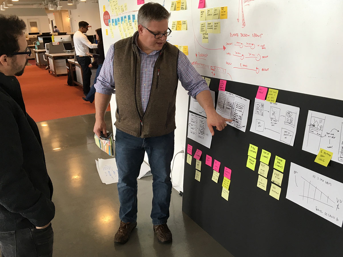
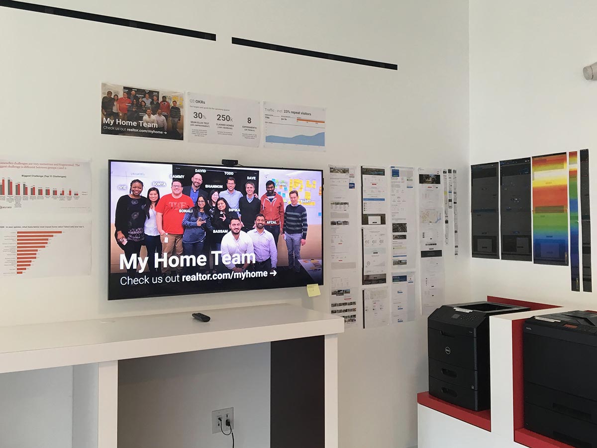
I love physical walls. They help visualise what's happening, provide transparency and insight in to what your team is doing and provides a focal point. The team works with their cross functional team to manage sprints and backlog with Jira. In turn they update the team at standup and I maintain/sync the physical wall.
In order to make the work small and achievable, we break our kanban columns and our design stories as small as possible. Focus on delivering a piece of business or user value and moving on to the next phase.
We partner with research to distill insights, analyse interviews and speak with & shadow users in the wild. We generate consumer experience maps and journeys. Competitive analysis and creation of a mood board provide inspiration and a common inflection point.
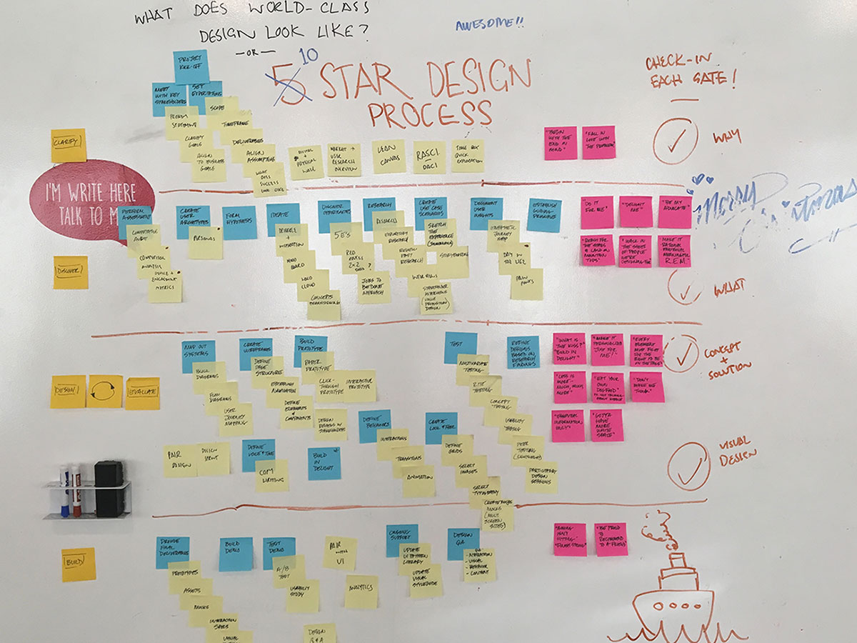
Are we super clear on the problem? It's critical we understand what we're trying to solve. It's also super important to be really crisp on the impact our work will have on our users and the business.
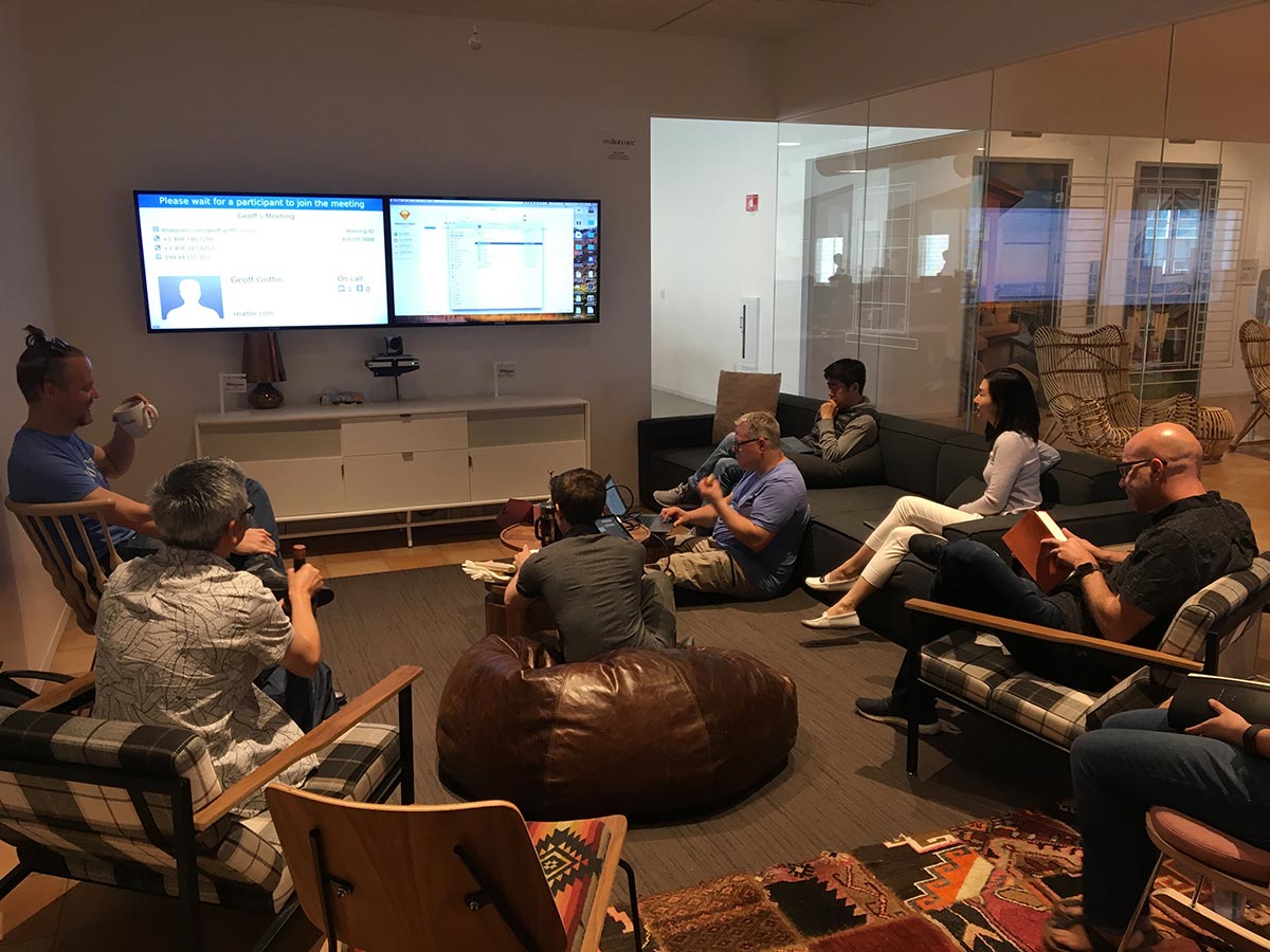
A kickoff is critical to ensuring the entire team is on the same page, not just for design. Essential to co-locate the entire cross functional team in person. Go through roles and responsibilites, establish a clear understanding of the problem, how it ties to the strategy and what success will look like.
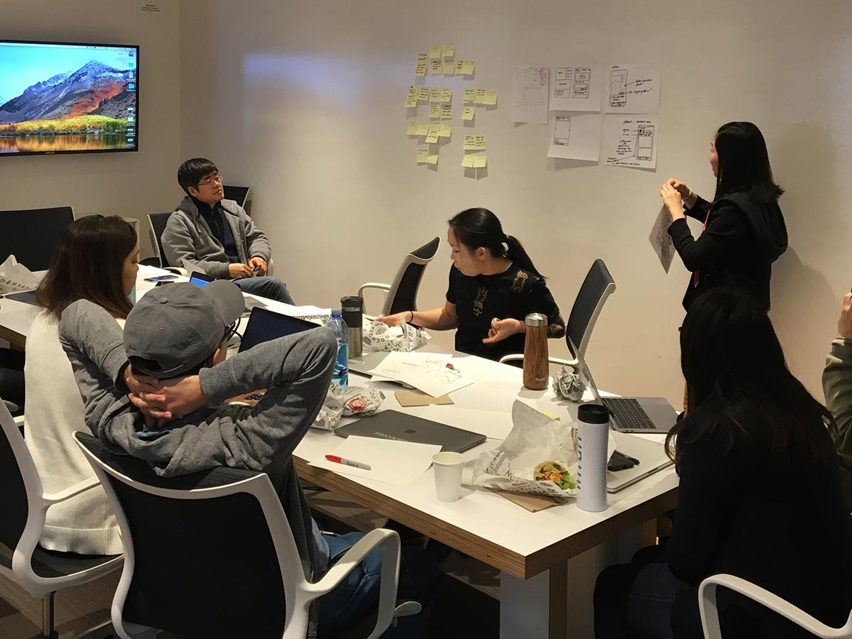
All of the analysis and understanding we've unlocked is presented to the team. We also take the time for some sketching and brainstorming with the group. We've taken the Google Design Sprint and condensed it down to half a day to generate a range of ideas.

View the design process above in large format
At this point the designer(s) and product managers undertake design discovery. Explore the ways in which we can solve the problem through experience design. Our first deliverable is a wireframe and interactive prototype to validate with users.
We have a simple mantra early in discover: there are no bad ideas
Generate all the ideas in the world. Discourage things like we've tried that before or that doesn't work. Embrace every idea, weed them out later.
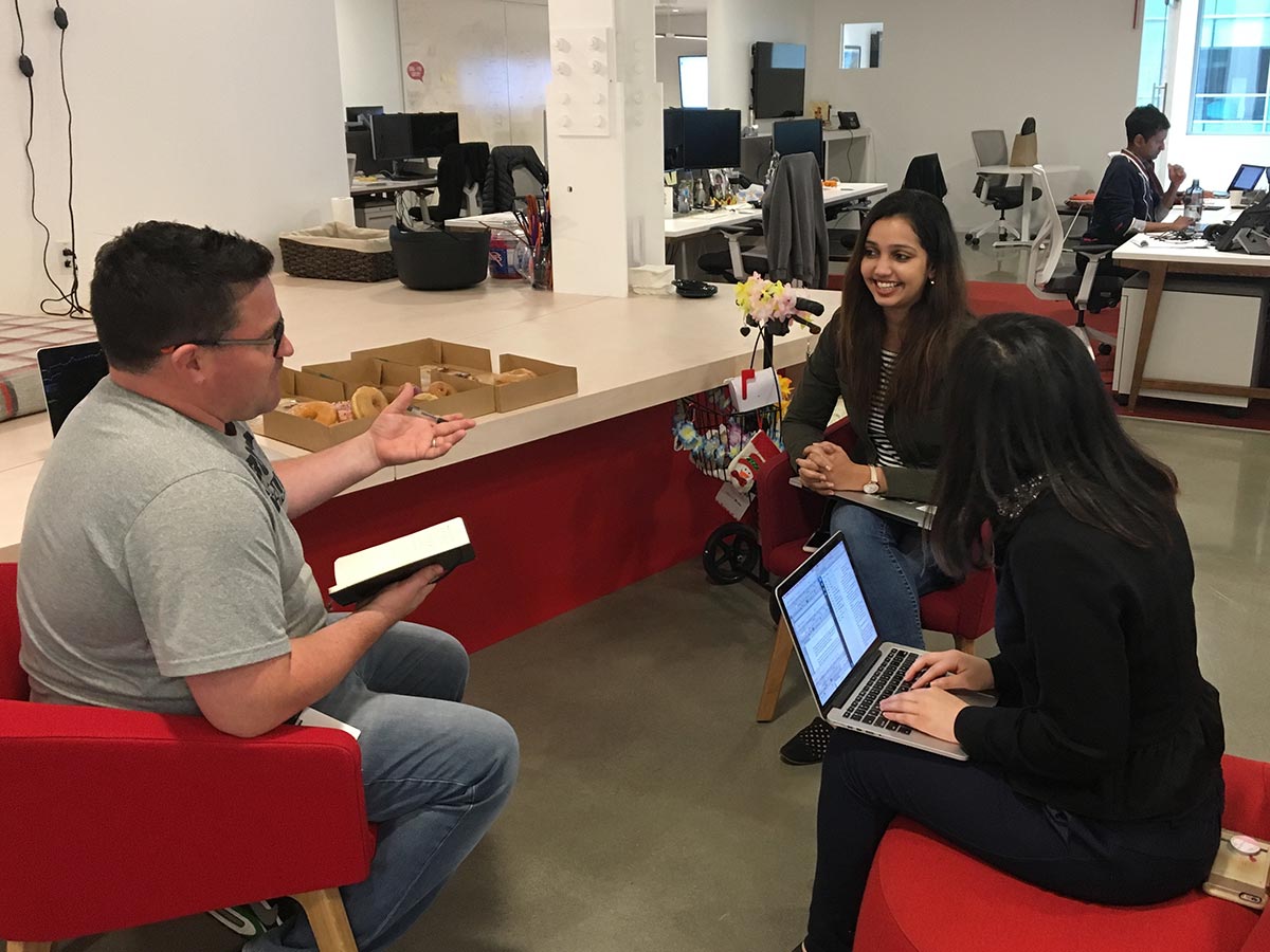
In addition to user testing with our research team in the lab and validating ideas with online tools, we encourage the team to share their work internally as early and often as possible.
Whilst real users are fantastic, I encourage the team to validate interaction patterns and UI options with folks around the office. Grab a box of donuts and setup shop in the lobby or wander around the office. Regardless of how well they know your product, a new UI presented on a phone with minimal context will still garner an honest response, not to mention you might meet new people or help evangelize design thinking with your colleagues. Win win win.
One of my favorite parts of discovery is when a non-designer will sketch up an idea, then when we review final designs there it is :chefskiss:
Adding fidelity is when we take extra time.. Really dedicate to getting the small details perfect. We ask everyone to use Go To Market (GTM) ready content (like fake addresses or names but also images we own or license) so the final comps are ready for public consumption. It also helps out your marketing team big time!
Need to pad out your design with fake brands or advertisers? Make up some fake ones, using people in your team or perhaps the head of sales or customer service. Watch in the presentation as folks start to realise that shiny new toothpaste advertisement in your mock is actually the same name as the CEO ;)
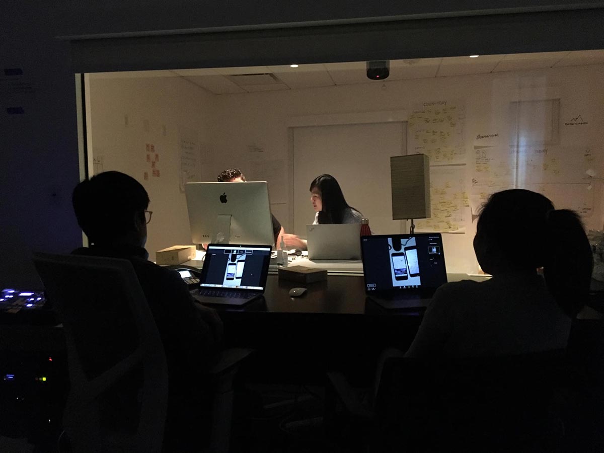
In addition to sharing progress regularly with our engineering counterparts, it's important to work with them through the iterations. We avoid at all costs a big reveal or throwing a finished design over the fence. Instead share often, invite their input and be present when kicking off the user story to build the experience.
Ideally we sit with engineers as they build the interface, effectively pairing on the solution.
Some of the principles we like to think of here:
Rather than MVPs, we've opted for a design principle we call Good Better Best to orientate our designs around 3 levels of fidelity and problem solving:


Whilst we've successfully moved to Mobile First thinking, we also like to think Mobile Prime: what can the device do for the web that a traditional desktop computer can not: geolocation, photos, camera, voice, accelerometer, Carplay etc are all capabilities we put to the fore when designing new experiences. What can the mobile phone do?
Low-fi first and fast because we aren't wedded to sketches or wireframes. Generate all the ideas, do it as time efficiently as possible. Note that this doesn't necessarily mean fast, just don't sweat the small details. Then when it comes time to really finesse the design, take all the time you need.
Instead of Fail fast we prefer to Learn Quickly. Focus on understanding user problems and observe how they use our experiences. Watch what they do, inquire about what they do. Don't ask them what they want.